@ed-71
- 707
Forum Replies Created
-
AuthorPosts
-
::
You’re right. It was that whole clash of systems thing, and I can confirm they have not fixed it.
I’m left with recommending either use the onsite editor or use “Paste as plain text” from the Windows copy buffer. I’m not sure if Android has the same option (I don’t use Android for web browsing).
::Also, if you paste as plain text text (right click menu) then you avoid such problems in the first place.
::You should be able to edit your own messages. You don’t get the “edit” link in the text menu? A few weeks back there was a huge discussion about that and we managed to get it fixed. It still works as far as I know. My test user can definitely edit his own messages.
::Creating the new table has been a little delayed. I seem to have caught plague over the weekend and am in no fit state to work on anything technical. I will get back to it ASAP. Sorry.
::Sadly the table looks quite thin with SO few participants listed. I’m aiming to post it in the next few days.
::I wonder if any of our current or former members have caused a fuss by being seen naked somewhere unexpected.
::Okay, construction of the new ranking table is underway. I’m probably going to do it in two stages.
::I need to find some way of reaching or persuading more MDL participants to let me republish their ranking table entries.
::Generally I try to keep AI generation (or photo editing) down to 3-4 levels of change. There are techniques to get around that, which I’m slowly learning, but it definitely requires creative planning to get the best out of it.
Do you think it’s worth doing some sort of non-nude video so I can show it in the public area of the community? I know non-nude kind of avoids the topic of this community, but this age-verification thing is stifling discussion.
::One more Qwen picture. None of them seem to do reliable male nudity unless you start out with a naked photo as a video source. Qwen is pretty good at changing the text on signs and posters.
You can see in this photo that too many tweaks and changes and you clearly lose image quality. Looks like 5-6 is fine, but much beyond that can cause problems. If you want to make the effort you can use a photo editor to neatly clone just the changes into the original photo, thus prserving the original quality.It’s still very much the case that the more effort and planning, the better the results.
::There’s a lot to learn, and the technology keeps changing and advancing. What you knew yesterday may be different today. I don’t know if you’ve seen the video I posted yesterday (age-verified forum), but I’m sure I would not have been able to create that just a year ago.
::HuggingFace can remove the towel. Setting up scenes in GetImg or Qwen saves my HuggingFace credits. I find it works best to use the strengths of each.
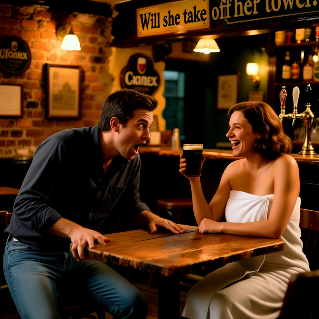
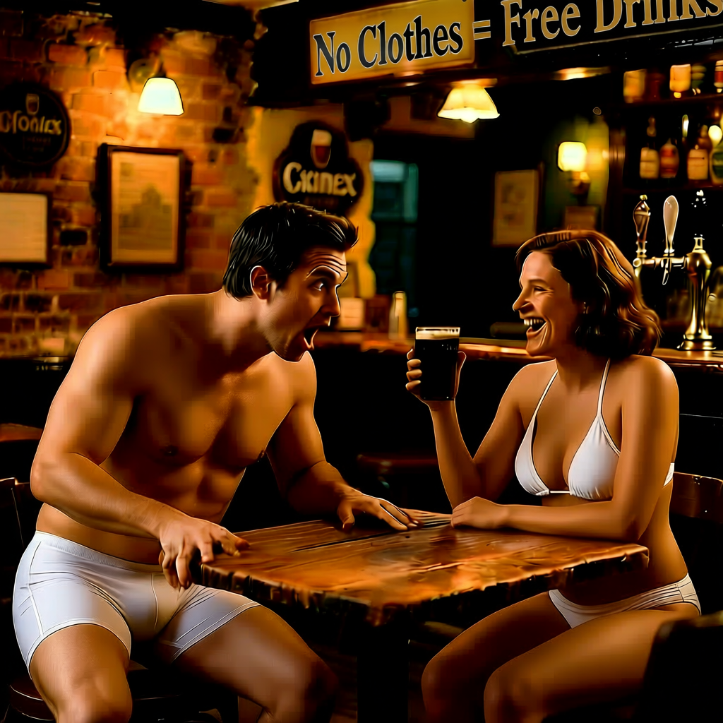
::Qwen created an image:
And then with the prompt “Put them both in just bikinis” produced this:
 ::
::I find Perchance is completely unpredictable, really inconsistent results. For my purposes, that renders it unusable. Huggingface gives credits daily now. Unless you pay, the free credits are only enough for 2-3 5 second clips per day.
I’ve never heard of Meta AI. I’ll give that a go. I know I tried SeaArt but it’s on the list of ones I gave up on (can’t remember why).
What I’d really like is one of the very high price accounts on Pollo.ai but I can’t afford that for now.
Qwen would be incredible if it allowed nudity. It’s the most consistent by far and allows fantastic editing of pictures to correct anything which isn’t what you want without changing the rest of the photo and without having to draw mats.
::For those of you who are age-verified, I’ve posted a first-draft of what I’m working on here:
::I’m not sure what counts as fast these days. My laptop has an 8-core Ryzen 7 with 4.4GHz clock speed. It works out about 20% faster than my desktop PC according to the benchmark scores, and it’s got 32Gb instead of my desktop’s 16Gb.
I should invest in a new NVidia card for my desktop, that would blow both of them out of the water.
::Well that clearly worked!
Two transactions since the price drop. That’s much more positive. Thank you, guys!
::GetImg and Qwen both block nudity, but they have other distinct strengths.
I use multiple different systems to get my results. I use GetImg to create characters, Qwen to create and edit scenes and HuggingFace to create the videos from them. When I have a lot more credits on Pollo, I’ll use that to produce the videos as it does much higher resolution videos.
::I’m installing it on my laptop. The “CPU-mode” is almost hidden but definitely there. My NVidia card is probably too old to support CUDA so, as my laptop is more powerful, I’ll install it there.
::I announced it earlier today on Patreon, but I just thought I should announce it here too.
The new £4 (+tax) price is in effect.
::The ComfyUI website says it requires an Nvidia GPU. They don’t mention that it runs without one. Do you need to do anything special to it to make it work on just the processor?
::I find Qwen and GetImg don’t produce extra limbs/fingers and are very good at producing anatomically correct people.
Giving the right amount of detail is the key. Try not to suggest ideas that would not have cropped up otherwise. The other thing is repetition. I find stating the same thing 2-3 times in different words tends to lock it in.
When I first got it to generate a nude woman turning around, I didn’t expect this:
 ::
::I know I’m not getting any feedback on this, but the potential is brilliant. I put together the clips I have done so far to make a 7 minute video with imperceptible image degradation. There are some minor glitches if you’re looking closely but I have to say for a first proper try, the results have stunned me.
Sound is the main problem now.
Definitely want to make many more clips, more ambitious clips and do something on an even bigger scale. There are all sorts of possibilities here. I might post this video on a age-verified only page tomorrow. Anyone interested?
::Thanks, Gary. Seems I already have you on the list.
So far we have 6 confirmed. I was hoping more of the original 30+ would get back to me.
::Easier to maintain is the most important for me. Building will vary between a lot of work and a HUGE job, but I want ongoing workload to be as small as possible. It means adding future submissions will happen faster, which keeps everyone happy.
::Clearly I must organised getting myself along to one or two of them to grab some photos. It would be good to chat with some people who have taken part too, and write an article about what’s involved (from the point of view of this community’s purpose).
::In which case, I will put the original price up by 60p per month (50p before VAT).
As I understand it, because I am putting the price down from £6 to £4, Patreon will move ALL existing patrons to the new lower level, even if they are paying a lower price. When moving up, it’s voluntary, but moving down I don’t get any choice – everyone changes.
::In a way it’s less. It’s only one table (the main work) AND by putting the uncensored photos on a single gallery page (instead of a page per photo), it’s just one link and only one restricted page instead of multiple.
It’s still a big work load to create, but I’m not going to get away from that. I’m really keen to get this right from the outset. I don’t want to have to build the whole arrangement more than once.
::There’s another way to do it. I can make the table public but have an extra column with a link to an age-verified gallery for each participant. There could also be the possibility of having a second link to a censored (rude bits obscured) gallery. This means participants could choose to only be in one or the other if they wish?
How does that sound?
::I’m finally free to adjust the Patreon price. £6, it turned out, was too high.
Now Patreon inform me that if I reduce the price, ALL existing members will go to the new price, but if I increase it, only new signups will be affected.
As a further complication, I can’t remember what the price was before I increased it. Can anyone remind me? (The UK price, not the converted currency prices or the mad Apple price.
::There’s been a big jump forward in the past few weeks, Qwen is very precise now. Wan 2.1 and 2.2 are much improved at following instructions. I’m finding the success rate is around 60-70%, instead of the 10-20% I was getting before.
::If anyone knows of an option anywhere which makes the members page public (which I’m not sure is a good idea, now I come to think about it), let me know. I can’t find anything.
::If I did that, I’d be spending more time logging in than anything else. Also, with so many things connected, if I log out of Word, I log out of everything else MS. If I log out of Google, same thing. I use Patreon about 30x per day. I can’t log in every single time. That’s mad.
It’s a nice idea, not seriously impractical.
::Sorry, I don’t know any more than that. I haven’t logged in for a long time. There are no options for login duration in the Patreon integration plugin. I suppose for Patreon users, it’s just one button press? (Unless you’ve logged out of Patreon too).
::As far as I was aware, that has always been the case. I don’t have any control over that.
In my experience only about 5% of members even know it’s there.
Also, don’t log out. That way, providing you visit at least once every 28 days, you don’t need to log in. That’s what most members do (I can see it in the logs).
::Fox tails etc. were never (and still aren’t) covered by the rules. That why I asked what everyone else thought. Explicit nudity and arousal are still not permitted, but I can’t in all honesty describe a foxtail buttplug (which is a new thing to me anyway) as arousal etc.
Currently in a grey area there and I do not know what to think.
::The problem for me is that I can’t really know how well the whole approach will work in reality. Once I’ve built the appropriate pages, it’s a bit soul-destroying if I have to rebuild it in a different approach.
::If the links are in the public (non age-verified) area and link directly to the photos (like the old site), then either the photos would be public (so I can’t do that). The closest I could get to that is to have public links linking to age-verified pages for each photo, however that means building and huge number of pages.
I’ve been wondering about keeping the MDL main page public but putting the ranking table on an age-verified page. That’s the simplest solution for me. That way, I can have a message on the main MDL page stating the advantage of being verified.
::I suppose another alternative is to have censored photos on the public table and then another table in the age-verified area with the uncensored versions?
I don’t want to make it too complicated and cause too much work for me. It increases the chance of errors and increases workload for me to maintain two tables.
::Last week was a bit of a write-off, but this week, I’ve age-verified three people. Not quite the 3-5 per day I’ve been hoping for but it’s amazing how many people contact me at 4am and are surprised I’m not online.
Should I put a UK flag in the header to show we are UK based?
::If anyone is in touch with any missing regulars on other systems (eg Facebook), please consider contacting them and encouraging them to return. Any community is only as good as its members and it would be a shame to lose some of our much-appreciated community contributors.
::We seem to have lost a few regulars, but that happened before the server move. I’m hoping they come back.
::I’ve no idea. Never even considered that one before. I’m guessing that most people would see butt-plugs as a sexual thing? I don’t know – I don’t know what they do.
::It’s the same vicious circle. People login, check out what’s happened since last time but don’t actually post anything (or vote or comment etc) then leave. The next person does the same, also sees that nothing has happened and also leaves without interacting.
Obviously, I post stuff every single day, often several things, but it’s SO hard to get other people to interact. This month looks like it’s going to beat last month by around 20-25% on total visitors, but that doesn’t really count for much if no-one posts anything.
::I’ve finally got around to posting the second version. As it features full-frontal nudity, it’s in the age-verified forum here:
Sorry it’s taken so long.
::So, too many things to do today. I might be able to start the cloning tonight (copying the entire site to the new server) and then activate it tomorrow but I don’t want to rush it and mess it up. This is pretty much a one-shot deal, and the consequences of getting it wrong could me the site being down for days while I attempt to rebuild it.
::I’m sure many here will be keen to hear how you get on. Hope you have a good time!
Good luck with getting some more MDL entries.
::I now know this won’t be happening today. I moved one of my other sites (much smaller and simpler) last night, and it took much longer than I expected. I’ll keep you all updated and I’m still hoping to have this done before the weekend.
::Noted! It’s beginning to feel a lot more worthwhile. I was worried only a couple of members would agree to having the entries moved across.
::Just to let you all know. The new price is in effect. It won’t exist existing patrons, but new signups will now cost £6 (or the equivalent in your currency). Apple will obviously continue to charge their tax on top (which should probably be illegal but I’m not going to fight that one!).
::Sorry, things have been slowed down by a glitch in the patron-only system. I think it’s fixed now but testing is required to make sure.
::So I’ve got 3 people who have agreed to me transferring their dare list photos across. Unfortunately, 4 people have refused and most of the others have not commented yet.
::Too many unknowns there. If you’re embedding/linking the video, it’s fine. Providing the video is within the community rules.
Also, only in the age-verified forums. No posting of nude content in the public forums. I need to update the community rules again, don’t I?
::I don’t use Discord anymore and I’ve never been to Reddit, but I don’t use phone apps or browse the web on my mobile (screen is TOO small), but there’s no way I’m appearing on webcam for a foreign website. Do you trust them not to document their compliance with the rules?
::Have any search engines begun age-verification for adult results in photo and video searches?
::It looks like the vast majority of sites don’t even know about the legislation. As they are mostly based way outside Ofcom jurisdiction, Ofcom only has two courses of action: It either ignores them or blocks them from the UK. I can’t imagine that blocking a huge number of websites from the UK will sit well with the electorate.
::I was thinking more of doing them by range. I’m still looking at ways of doing profiles but Patreon bypasses that entire system.
I tried on the old site of asking people to fill theirs in but most ignored it.
::Like most of the generators, you have to use stress and repetition to get reliable full nudity. On HuggingFace, it depends very much on which model you use.
I’m going to spend more time experimenting. It would be good to find a good one with a 20-30 second time limit instead of the 4-5 seconds most enforce.
::There’s a petition too:
https://petition.parliament.uk/petitions/722903
It’s picked up substantial support. I think now some news sites and forums are beginning to apply age verification too and many foreign sites have just chosen to block the UK, it’s affecting a LOT more people than the government said (which we all knew).
::That’s only going to work for foreign sites. According to Ofcom I believe they must age check anyone. I’ve been reading an article on the Ofcom site which states UK sites are still responsible even if the customer uses an undetectable VPN.
A VPN won’t get around NE age verification.
::I need to keep a list for this, but I’ll move both of you over when I build the new results table.
::Okay – that’s brave!
No rush. I’m unlikely to have opportunity to do anything for the next week or so anyway. Also, the trial subscription I took out has now expired and my remaining credits went with it 🙁
::I’m not having 3 recent posts blocks on the same page. After all the discussion and debate about the other one near the top of the front page, I don’t want to remove that one.
::I need to contact every participant first AND sort out some way to integrate the table with the age-verification system, before I can build something. More than half of the participants haven’t come to this new site yet
::A lot of them are, I’m transferring a few more every week.
I wanted to post 2 per day, but I just haven’t had time to do that consistently.
::Same spec really.
Good lighting, sharp focus, highest resolution you can and, for this one, no clothes.
Any ideas what sort of people you would like to join you in the video? I can’t specify actual people, obviously, but general age, build, sex, clothing etc.
::Has anything changed? I’ve tried modifying the permissions. Hopefully no-one can delete other people’s posts or replies!
::The old site is now closed. Don’t worry. I’ve still got the content, but transferring photos/videos is going to take months.
::The MDL will be updated tomorrow (or removed if I don’t have time). There won’t be a version behind the age-verification wall for a while as it’s a MASSIVE job. Also, I need permission from all participants to put their photos on the new site (currently the table here links to the old site). The vote-offs are not yet on the new site, so they will be going away, at least temporarily. I haven’t decided on what to do about those. Your lost bet video will be temporarily going away too. Again, don’t yet know what to do with it.
Essentially, I have about 6 months work to do in 2 days.
::Comments are different things to posts. Users can delete their own comments but only admins can delete posts. I’ll see if I can change that.
::I’m on a laptop so adding a suitable GPU isn’t an option.
The code used for LLMs is madly inefficient right now. We should see 8x improvement once someone optimises it, that combined with processor improvements in the next few years should see impressive speed advances. I’m assuming the next generation of main processors will have GPU-like qualities ready for this sort of processing too.
::I can’t find a downloadable one that doesn’t require a discrete graphics card (and/or Linux). It would be good to not need credits to use it.
I’ve always assumed that any photo put online will end up in all the AIs training data. I know a huge number of the photos I’ve put online are copied and posted in MANY places. It’s illegal, but what can I do?
::I haven’t tried it recently, but I’ve been told Perchance took a major step backwards in quality last year. I suspected they turned down the processing available for each prompt.
I haven’t found any AIs are any good for writing fiction. You see phrase patterns, odd grammar and poor descriptive word choices, repeated over and over. Any experienced writer will spot them very quickly, and that’s before the continuity errors and poor understanding of physics and hierarchies (He removed his hat, revealing his T-shirt etc.).
All of the ones I’ve tried are better now than last year, BUT there is a storm coming. A lot of the stuff they are learning from is AI generated, so these mistakes and faults are being fed back into the system. This is a feedback loop of junk in the system and I can’t see how it won’t just cause it all to deteriorate again.
::In that case, the AI can only be as good as the description. Inaccurate, incomplete or contradicting descriptions and reviews are always going to thwart the desire for accuracy. Just look at some of the reviews on Amazon (and other sites) that make no sense, are wrong or simply fake. An AI has no chance.
-
AuthorPosts