@ed-71
- 707
Forum Replies Created
-
AuthorPosts
-
::
The pattern seems to be: a bot/person finds a crack in the security and creates a bunch of users, assuming that at some point that crack will be sealed. They won’t draw attention yet as that will encourage the security problem to be addressed. Instead, they hope the new accounts will blend in. Then, slowly over time, they can use those accounts to post adverts or scam inside the site. Delete one account and there are others waiting dormant.
Our advantage is that being a small site, the sudden surge of new accounts usually gets noticed.
::I deleted the 11 “members” who signed up yesterday, all on the same e-mail domain. Of the 8 I saw online, 4 were at least people I already knew from the site (so not spammers).
::Yes, either start a new thread or continue existing conversations (of which there are many!). We used to have a live chat feature (in the bottom right corner of the site) but that was a total flop.
The forums are supposed to be the centre of interactions on the site, but obviously there are pages and blog posts where you can comment to. I’d only recommend DMs with people you already know from other interactions.
::Okay, let’s drop that idea then.
I’m looking for what resources might be interesting or useful to members on this site.
::Regular visitors may notice that the standard 3 forums has just reduced to 2. Hopefully this will focus activity in a smaller area and make it easier to work out which forum to post in.
::The number of visitors has been increasing steadily for the past two months. I haven’t seen any sudden spikes but any efforts to draw more people to our community are incredibly welcome. Thanks!
It would be good to get another competition going but we need to get some female participation AND I need to find an easier way to run it without causing me 2+ weeks of heavy workload.
::Probably yes, but I can’t claim to have seen more than 1% of the movies out there. And I mean mainstream cinema releases, not pornos.
::If you have a Windows account or a Microsoft account, you already have a Teams account. I’m not suggesting DMs for login or signup problems. That’s what I use Teams for.
I’m trying to avoid adding any more plugins to the site. Ideally I want to reduce them.
::No. It would need to be inside the age-verified section, obviously, but I think it could be done.
However, I agree, there probably isn’t enough interest.
::Every time the law changes here in the UK in a way that affects this site, it’s always negative. It’s depressing. We keep adapting and complying but I fear it’s only a matter of time before the government squashes us completely. There are rumours they plan to ban VPNs or add some sort of mandatory ID requirement for them. I suspect that will kill the online adult industry in the UK (we might see physical media make a return!).
::That’s kind of my feeling on the matter but I have been wrong before (many times before!).
::I’ve just tried visiting on my mobile and it seems the site works MUCH better in landscape:
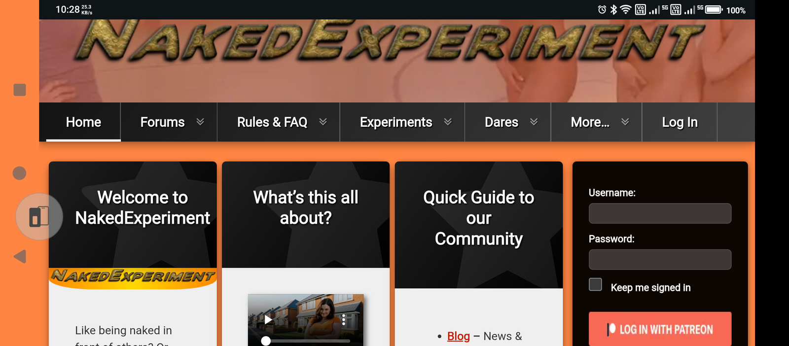
The first adjustment I’d make is to decrease the columns from 3 to 2.
::Does Android not do the double-click focus thing (where you double-click on a column and the browser zooms to make that column screen-width?
::I turned it back on last night. I thought I mentioned it in this thread but my post didn’t appear.
What I find weird is I get the hamburger menu on my mobile phone (in place of the main black bar menu). I only see all the menu drop-downs listed on my laptop. We now seem to get the full-browser menu on mobile devices when there clearly isn’t room for it? When did that stop working?
::I’ve changed nothing to do with phones. I’ve got zero controls for that. I’m not aware of any changes in recent theme updates. I think all the theme updates have been bug fixes.
::That sounds like the admin bar (a thin bar right across the top of the canvas). The old site had that but I don’t believe the new site has ever had that?? I didn’t enable it as it caused no end of confusion on the old site.
::That’s a feature of the theme. Mobile phones are always so zoomed in that there isn’t room for the columns. They’ve usually got the screen resolution, but the webbrowser software will not use it. Mobile web browsers stack the columns with each above the next one.
I only time I use my phone for browsing is when I’m testing the site. Mobile browsers are a disaster – bordering on unusable. The last time I had a good mobile browser was back in 2007 and then the iPhone came out and everything went titsup after that.
::I’m not sure. There’s still a profile button (to the left of your username) at the top of the right column. If you don’t have an avatar set up (please do!!) then it would default to the first letter of your username (unless you have a Gravitar profile set up, then it uses that.)
Clicking on it still takes you to your profile.
The messages and updates pane personalised to you has been gone a LONG time bacause it stopped working.
::I’ve tried to get quite a few of them to come back (mostly a couple of months after the site moved here) but almost no success at all on that front.
If anyone is in contact with anyone, please encourage them to come back!
::Also, I thought it would be an interesting and fun way to raise some points, causes a smile or two and highlight some nudity-related issues.
::My fundamental problem is it’s that video content or no video content. The community has had a lot more visitors when I’ve got some videos to post on social media etc. (about 3x). I haven’t posted any for a few weeks now and traffic is way down again.
Just male nudity puts people off the site. Male video content is not popular. Also, too much male-only content puts women off staying here. It’s near impossible to get women to post and, often, when they do they ask me to remove what they’ve posted within a few weeks.
Fundamentally, I don’t have the budget to make this work and I’m not going to get the budget while it’s not working. I don’t know how to get out of that vicious circle…
::I think that suggestion could work. My only reservation is that we had something quite similar before the Master Dare List (Weekly Dare Challenge) but it was a lot of work. I used to receive a lot of PMs and e-mails from people demanding to know why the threads had been locked (even though it said at the bottom of each thread), and when they weren’t locked, it was difficult to keep track of all the submissions (and to stop people posting stuff nicked from the web). The MDL was designed to solve the problems suffered by the weekly challenge.
Also, I’m not here consistently. Most days I’m around several times in the day, but I occasionally have weeks when I’ve got no time available. If we did it in some way where the weeks don’t have to be consecutive, that could work?
::I’ve had two days now of a zero limit (ie not even one picture generation) on Grok. With the two others I use too, I’m getting enough credits to produce 4 videos per day, in total. With that limit, I’ll struggle to get one finished video per day out of it.
With at best unclear levels of interest in the results, it was fun while it lasted, but I can’t see a future in these. I was looking forward to being to produce videos of many and varied nudity-including situations. One idea was to create a second Patreon account for just the videos but I just don’t think enough people are interested for such a channel to be viable (the cost would far outweigh the turnover).
::I’m not sure what’s changed but in the past two days, I’ve been finding that the generation limits on almost all the generators has drastically dropped. Instead of getting 25-40 (ish) goes per day, I’m lucky to get 3 now. Grok is only allowing me to do ONE per day.
Developing new techniques and better output is going to go REALLY slowly while that’s in place. Maybe I’ve hit some monthly limit as well as the daily limits, but it’s also possible they’ve all cut the freebies they offer permanently.
I’ve got a few clip videos in reserve but producing new ones isn’t really viable now.
::The old site had many regulars who interacted frequently. There were hundreds of other visitors, but it had a strong core of frequent posters. Our current site gets nearly as many “other” visitors but has been less effective at persuading people to sign up for a free account. However, the worst thing is we’ve lost the majority of the posting regulars.
Some of that is the age-verification, but many left before that was introduced.
::The links are not active yet. I’ve got about 20 pages to create it was only in the past 2 days that we’ve got the age-restriction system working again. Until then, I didn’t even know if it was possible. There is a message at the top of the page saying that not all the links work yet.
I’m away for the majority of this weekend and next week is really busy. I reckon I’ve got about 4-5 full days of solid work to build all the necessary pages and then some more time to check and test everything thoroughly. For some participants, I’ve got 30 photos to post and half of those will need censoring.
I still haven’t had replies from many of the participants regarding permission to post their results. What you see on the table so far is just those who have replied, so far.
::I’ve just been looking through some of the video clips which didn’t go so well. Most were just junk and didn’t get saved, but a few are hilarious and I kept them. Having seen the collection all at once, it’s great fun. I might do a video of all those clips too, like a sort of bloopers real.
::It really looks like this finally works properly. Thanks, everyone. It’s much more thorough than just me testing it.
::There are also a couple more NSFW ones too. It’s really hard to measure the level of interest in any of these.
::No. Haven’t had time to work on it. I also haven’t worked on any clips this week. I’ve got a few “Flicking Channels” videos in reserve but there hasn’t been huge demand for them. Comedy has been more prevalent in the most recent ones but I haven’t put them up yet.
::I’m getting the feeling that to progress further (done around 200 successful clips now – and no I haven’t posted them all). I think to progress further I need higher-resolution generation and access to unmoderated nudity. I have no way to know how popular that would be??
::Well they’re both faulty. The NSFW videos page doesn’t work. The “What’s the problem…” page isn’t set up properly and isn’t age-verified. If I turn age verification on for it, it instantly develops the same issue as the videos page. The system used to work, the only clash I got before was where I wanted age-verified and patron-only at the same time.
To make things more fun, I’m quite busy this week so I don’t have much time to work on this.
::The Patreon plugin works fine for pages but I don’t use it for age verification. I don’t know how I could do that. The age verification is done manually by me. Unless you are added to the verified group, you can’t see the age-restricted content. Essentially the two systems are pretty much separate.
Patreon only allows restricting by Patreon level (ie fee paid). I don’t think they know your age or give me access to that data (which they probably don’t have themselves). I’ve never been aged-checked by Patreon.
::It seems the age-verification protection only works in the forums. I can’t get it to work with pages.
::It was discussed but I haven’t taken anything away. Also, since we’ve added censored photos as an option there’s not so much reason not to publish (face can still be censored as before).
::I get “not authorised” errors when I try to view age-verified pages. The forums work fine.
I haven’t set up any of the MDL links yet, until I get the age-verification working properly.
::Don’t forget your photos only get published if you give permission. You can still take part without publishing. Or you can have ONLY censored published, or ONLY uncensored published. It’s entirely up to you.
::The main results page is essentially active now but I’m not ready with the photos. The nude photos will be in the age-verified area but I’m still undecided on putting censored versions in the public area.
::One more thing, is humour a good thing for this? (like the failed cartwheel)
I don’t know if it makes it more memorable and engaging or just detracts from the key message?
::If any of you know anyone who was on the old MDL, please contact them. Most of the people who didn’t make it from the old MDL to the new one didn’t reply to any of my messages/e-mails.
::If anyone knows how to get real women talking about their experiences on video, please let me know. I haven’t found a single woman so far who is willing to have photos/videos published, even with a face blurred.
Also, blurred face videos are much less effective at attracting attention.
::One thing I have learned from many years of experience is that men do not sell the site. I need a minimum 50/50 split of female to male.Another thing I’ve learned from experience, using real people is a nightmare. If I use three people (assuming I could get three volunteers in the first place) then within 12 months one of them would be demanding I cut their section from the video.
I’m stuck in a vicious circle here. The site desperately needs more people to be viable. These videos seem to have roughly doubled our visitors lately (it’s hard to be sure as I’m also pursuing 4-5 other promotion methods too). None of the current female members are willing to appear in videos/photos anyway. If I produce a video of just men talking, it simply will not work.
I’ve closed almost all my other sites in the past few months. I’m seriously considering shutting everything down and giving up.
The only reason there seems to be a focus on the generated videos is that nothing else gets much interaction. I try to start something like 10 conversations a week in the forums. Most of those are just me, nobody else joins in. I get no comments on most of the naked videos I post, and they rarely trigger a conversation. I’ve been trying not to post AMOC and SGC content (which I have a HUGE amount of) because I don’t think it suits the site any longer. If anyone posts in the forums, I try to reply, but it feels like no matter what I do, the momentum just isn’t there any more.
Building the Master Dare List has been a massive job (and still is) but it’s hard to be enthusiastic when I can’t see any interest in it. My main focus is the experiments (more coming soon) and getting more people to find the site. I stopped posting generated videos in the forums a couple of weeks ago, but now activity in the forums has dropped off a cliff too.
I’ve tried getting some sort of discussion going about how to handle the MDL, but no-one’s interested. I tried discussions on si
One thing I have learned from many years of experience is that men do not sell the site. I need a minimum 50/50 split of female to male.Another thing I’ve learned from experience, using real people is a nightmare. If I use three people (assuming I could get three volunteers in the first place) then within 12 months one of them would be demanding I cut their section from the video.
I’m stuck in a vicious circle here. The site desperately needs more people to be viable. These videos seem to have roughly doubled our visitors lately (it’s hard to be sure as I’m also pursuing 4-5 other promotion methods too). None of the current female members are willing to appear in videos/photos anyway. If I produce a video of just men talking, it simply will not work.
I’ve closed almost all my other sites in the past few months. I’m seriously considering shutting everything down and giving up.
The only reason there seems to be a focus on the generated videos is that nothing else gets much interaction. I try to start something like 10 conversations a week in the forums. Most of those are just me, nobody else joins in. I get no comments on most of the naked videos I post, and they rarely trigger a conversation. I’ve been trying not to post AMOC and SGC content (which I have a HUGE amount of) because I don’t think it suits the site any longer. If anyone posts in the forums, I try to reply, but it feels like no matter what I do, the momentum just isn’t there any more.
Building the Master Dare List has been a massive job (and still is) but it’s hard to be enthusiastic when I can’t see any interest in it. My main focus is the experiments (more coming soon) and getting more people to find the site. I stopped posting generated videos in the forums a couple of weeks ago, but now activity in the forums has dropped off a cliff too.
I’ve tried getting some sort of discussion going about how to handle the MDL, but no-one’s interested. I tried discussions on site layout, trimming features to focus activity, on helpful links and much more. Most of them got zero replies. Also, if I try too hard in the forums (like I have this week), it tends to look like it’s just me talking to myself and that puts people off participating.
There’s a plan for the generated videos, but it’s going to take a lot of research and practice to get there. The Flicking Channels videos have been one of the more popular things I’ve done on the various social media platforms, and it’s more effective to have a stream of content rather that post the same video over and over. The big advantage for me is I don’t have much time available and I can build the Flicking Channels videos from a byproduct of something else.
::In case you’re wondering why the resolution of the clips varies, I’m using a combination of several AI systems to generate them. They all produce different resolutions and frame rates.
::I find it’s worth clearly stating the accent you want (probably for each speaker separately). I usually end up defining everything. Leaving anything to chance more often than not produces random nonsense. One thing I’ve found almost impossible is having characters where one has one accent and the other one has another. The only way to do it seems to be separate clips using the final frame of one as the start of the next.
Voice intonation is hard to control, and not consistent. Also, when you’ve been trying to get a motion to work over 6-8 tries and when it finally works, the speech isn’t quite perfect, unless it’s unacceptable, I’m not going to keep trying.
I’m hoping to have the first NSFW Flicking Channels video ready later today. I should stress it won’t be full-on nudity (which is where I’m aiming to go) but the clips where there is unintentional nudity (where the AI made a mistake), such as missing clothing, nip-slips etc. There will be occasional full-frontal nudity in them but not a lot.
::If I used the word “naked” in the script, it increases the chance of being “moderated” hugely. The silly thing is the AI is fully aware of what I’m trying to get the “actors” to say but there seems to be some sort of simply keyword filter which doesn’t get it. The moderation is clearly a multi-level filter system.
What’s amazing is that sometimes the clip I’m prompting doesn’t include any problem words or obscured nudity and the AI produces full frontal nudity. It’s rare, but it happens. The filters are not very accurate.
::I’m doing a range of things to increase the number of visitors to this community and the first promo video seemed to cause an upward bump in the figures. I probably shouldn’t be so lacking in confidence that the new one is both better and doesn’t require any changes. I’ll try it instead of the first one.
::Sadly not quite gaining momentum, but I verified one person per day for the past three days so it hasn’t stopped. I try to be online regularly every weekday morning. I’m on at many other times too, but I figure a regular window gives everyone a target to aim for. The problem is life is busy and, as I’m still very much recovering I have a couple of medical appointments each week and they tend to be in the morning.
It will get better, as will I.
::Well, you’ve probably noticed two more additions to the Master Dare List results table, but sadly we lost a LOT of participants in the site move.
I’ve updated the results page a few times recently and have been working on how to display the photos etc. Obviously, any nudity must be behind the age-verification wall, but I’m keeping the results completely free (ie not Patrons only). It looks like the best way will be to have a results page per participant.
::Just uploaded another “Flicking Channels” video on the dedicated page:
I won’t be posting them directly in the forum.
::I’m wondering about adding Opera to the links page. Given the OSA here in the UK, I suspect it would be useful for many people.
::Here’s the second version:
If I had a proper budget, I could do this SO much better. Working in FullHD (for the original clips and images) would enhance the finished image quality hugely and make it much harder to tell it’s generated and not real. I think I’m getting better at scripting the acting of the people but I could SO much more with a budget. I’d love to have a go at producing a generated recreation of one of the real life experiments but doing it the way I’m working now would probably take months.
Anyway, what do you think of what I’ve got so far?
::It will take a few days to put it together, but I’m slowly working on another version of the advertising video. I figure the better it is, the more people it might attract to our community. Right now, we need as many as we can get.
::Mine’s using the North American location but I don’t get anything like that speed through it (Without the VPN I get 250-300Mbps).
::It seems when it goes to the sales page for the paid VPN, just close the page and the free VPN is there working anyway. I think they’re pushing hard to get everyone onto the paid service.
The free one is very slow (around 50-100kps) but it works. Thanks!
::I’ve reinstalled it. It tells me the VPN needs to be switched on, but pressing the on button on the VPN control pane just gives the message “VPN unavailable”.
::There is a VPN button but when you press it it takes you to a pay to choose the plan and pay. There was no free option.
::Would it be reasonable to hold a vote-off event specifically to raise money for video generation credits (probably with Pollo.ai)?
I don’t think an event would work until we’ve got more regulars, but it’s probably more realistic than attempting to increase the number of Patrons by around 50-60.
::The Flicking Channels videos don’t really have a story (but they do have some recurring themes), so it’s less obvious with those.
::I’ve uploaded the next one (on the Flicking Channels page.) The NSFW one is going to need a new page in the age-restricted area. There isn’t a lot of nudity in it, but too much for the public area.
::I should upload the next two “Flicking Channels” videos and I’ve got a NSFW version too, if anyone’s interested?
::I think I would struggle to faithfully follow a story which hasn’t been structured to fit with the video generation workflow. Also, male nudity is particularly expensive on credits (about 8x I reckon).
::Maybe I should come up with some potential projects and find out from community members which are the most popular ideas?
::I wish I could claim credit but about 98% of the effort is external. I just craft the prompts and put the results together in my video editor. When I’m let loose again with one that supports unrestricted nudity, MANY things will become possible.
I’m hoping to use what’s available in the meantime to drastically increase community membership so I can ultimately raise enough money to buy a month or two of credits to do more extravagant (and naked) projects.
::Essentially I forgot to add it. But I’m not sure it would help the advertising effect of the video and there’s no requirement to label it on most platforms. It was just something I decided to do.
::I didn’t realise Opera was still going. It used to be my main browser many years ago.
Thank you for letting me know. I’ll download it tonight.
::Yes, but it’s cheaper to pay for a new ISP than to keep paying for my existing one AND a VPN on top. Although that depends on the price of the ISP.
Mind you, I might have to get a VPN anyway. The way things are going, we all will.
::Rather than, in future, posting these videos in the forums, I’ve set aside a separate page for them here:
::I will get to this, but haven’t been online much for the past two days. Maybe this weekend?
::A group who already know each other. It seemed a couple of them were rather more enthusiastic than the other two. We hadn’t reached the interview stage, so I’d mostly spoken to the person who originally contacted me. I’d had a little contact on Teams with two of the others but hadn’t spoken enough to get a feel for how serious they were. The leader of the group seemed to assume she could talk the others into it…
-
AuthorPosts