- 172
- Power Poster
Forum Replies Created
-
AuthorPosts
-
::
@ed
Did this get solved?
In case it’s relevant, https://learn.microsoft.com/en-us/troubleshoot/microsoftteams/teams-administration/resolve-new-teams-launch-issues
::Liking, with or without unlikes, isn’t appropriate for a proper vote.
In a properly vote there should always be an absolute minimum of three answers, for example:
- Yes
- No
- I’m not bothered either way (or don’t konw, or similar, depending on the context).
In other cases there might be more, and might need multiple selection from the available answers:
- Red
- Blue
- Green
- Don’t care
- Other (please state):
None of this can satisfactorily be done in up/down voting.
If I remember correctly, there’s a way to post a “proper” votes with plural options in the opening post of a thread. That’s the best place to have a vote.
::The upvote button is all that is needed.
The upvote is useful, because it’s a very concise way of expressing support or thanks without needing to post about it.
The downvote isn’t useful on its own, because it would be very rude to give somebody a downvote without also posting a polite explanation about their differing opinion. But having the downvote button makes it too easy for somebody to rudely post a downvote without saying why.
We’ve survived for many years without having a downvote button and not had any problems due to it. Best keep it that way 🙂
::Also, it let me post a message to you in yesterday’s chat, so I think that means it still knows who you are.
::Teams seems to be at least partially working. I logged in this morning and still seem to be logged in at the moment.
::I like the like.
I don’t really like the dislike, because on forums that allow dislikes, there’s generally somebody who will abuse it (by systematically disliking each and every post by a particular person) even if there’s not anything controversial in the post, and therefore doesn’t justify a dislike.
Worst place is the microsoft feedback forum. At all times there seems to be at least three dedicated microsoft disciples (who may or may not be staff) online, poised to post downvotes within minutes of anybody making the slightest criticism about an unwanted change. That’s made worse by the default option (that most readers don’t know about) to demote posts with more than 3 downvotes. So it becomes a race for at least 3 disciples who are online at the time to quickly downvote anything that criticises an unwanted change before anybody else can see the post and upvote it. Result — it’s a total waste of time posting any criticism there, because any negative comments are semi-automatically hidden from anybody that might agree and upvote the comment.
::@TheG: “I confess that I took the 1K size limit as a challenge”
Maybe it needs to be reduced to 1 byte 🙂
::Not quite “AI generated” and they’re not naked either … but the idea that robots could be programmed to play football intrigued me. Some of the results are even funnier than I expected.
https://www.bbc.co.uk/news/videos/c5ylkyrkjnzo
::@ed #844
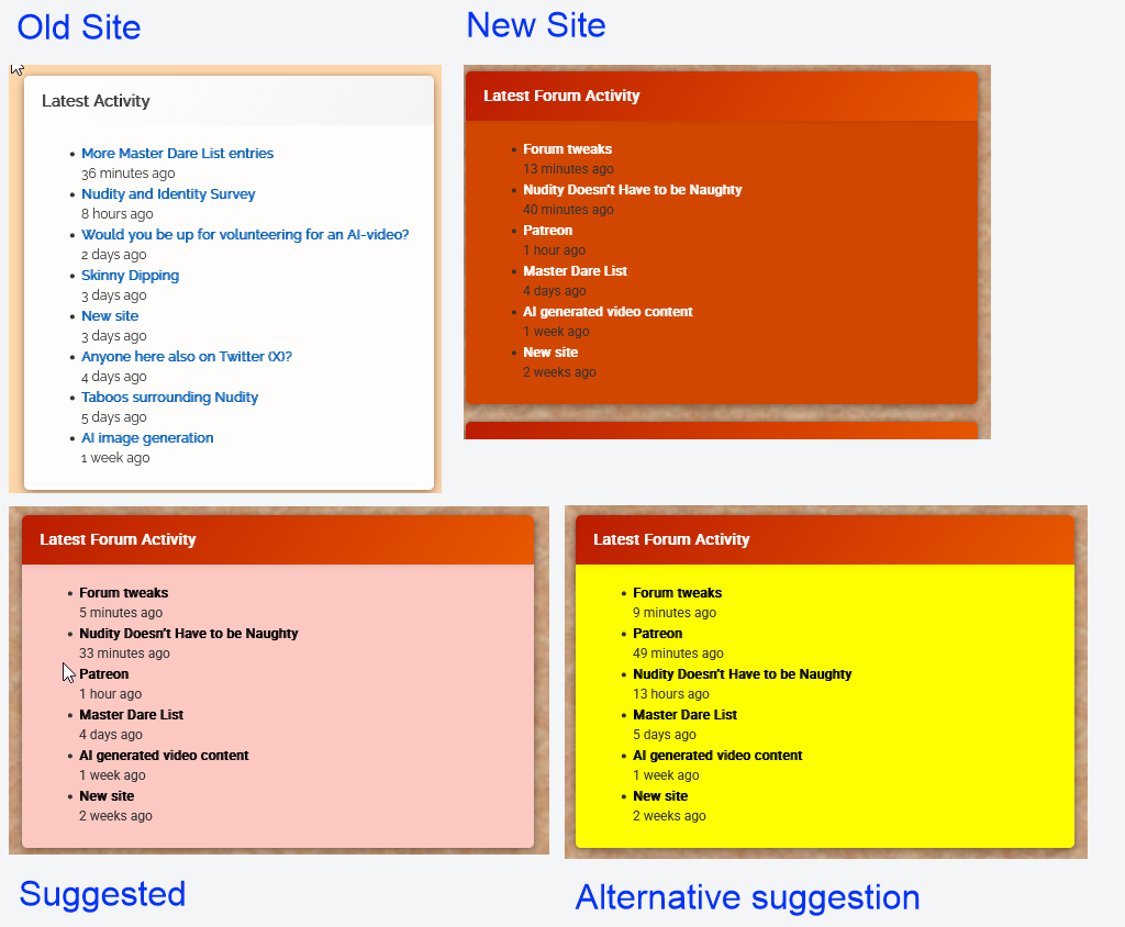
As expected, Latest Forum Posts on the blog page shows up a lot higher in mobile view than Latest Forum Activity which requires a lot of scrolling to reach.
Minor disappointment is that it doesn’t include the timestamp (eg 14 hours ago) and it links to the thread’s opening post rather than the actual latest post. That makes it a bit less useful than it could be. Ideally, the title should link to the opening post and be followed by a timestamp that links to its latest post. But it is probably still useful even without the timestamp.
::@ed: “There is a bodge I can use to display latest forum posts in a blog post. It’s not ideal but would that do the job?”
If it doesn’t involve a lot of work, it would be worth trying.
::@ed: “What do you think of the yellow then?”
I saw it a few minutes ago, and it looked OK but the post titles had mysteriously lost their bold attribute.
Now I look again and the bold is back, but the text has turned grey (rgb(85, 85, 85) instead of true black.
“That’s a level of control I don’t have. All I can pick is a colour scheme.”
If I understand https://op111.net/posts/2008/08/wordpress-child-themes/ correctly, it should only require a style.css with an @import statement and a line or two of css for any element you want to change.
But probably best to just go with the yellow (or whatever other colour is agreed) to get the new site launched, and then think about more detailed tweaks when the dust has settled.
::@ed: “Is the orange not considerably brighter than the black on your screen?”No, that’s the problem. On my windows 10 desktop, it’s not much lighter than the black.
I’ve since retried this on a new windows 11 laptop. It has given the same result, even after performing colour calibration (that confirmed it was already correctly colour calibrated).
My rule of thumb is that to be properly legible:
- black text should never appear against a tint of more than 30% of any colour other than yellow
- white text should never appear against yellow or a tint of less than 70% of any dark colour
- there is no possible background colour which provides optimum legibility for black and white text. Anything between 30% and 70% will always have limited legibility and a background cannot be less than 30% and more than 70% at the same time
- most colours other than black or white are best displayed on a white background. Yellow text is best displayed on a black backgroun.
- but whatever the background colour is, it cannot simultaneously be less than 30% and more than 70%. So trying to display black and white text together against a single colour cannot give optimum results
“I’ve set eight of the right column boxes to different bright colours to show the options.”
My impression, with the better choices in bold:
- The blue is working fine, but would not work if it had any black text in it
- The lime just about works, but would probably not work with white text
- Crimson works fine with its white text, but would not be good for black
- Pink would work better with black text if it was a lighter shade
- Teal would work better with black text if it was a much lighter shade
- Purple is great for white text, but would not work with black
- Violet is g
@ed: “Is the orange not considerably brighter than the black on your screen?”No, that’s the problem. On my windows 10 desktop, it’s not much lighter than the black.
I’ve since retried this on a new windows 11 laptop. It has given the same result, even after performing colour calibration (that confirmed it was already correctly colour calibrated).
My rule of thumb is that to be properly legible:
- black text should never appear against a tint of more than 30% of any colour other than yellow
- white text should never appear against yellow or a tint of less than 70% of any dark colour
- there is no possible background colour which provides optimum legibility for black and white text. Anything between 30% and 70% will always have limited legibility and a background cannot be less than 30% and more than 70% at the same time
- most colours other than black or white are best displayed on a white background. Yellow text is best displayed on a black backgroun.
- but whatever the background colour is, it cannot simultaneously be less than 30% and more than 70%. So trying to display black and white text together against a single colour cannot give optimum results
“I’ve set eight of the right column boxes to different bright colours to show the options.”
My impression, with the better choices in bold:
- The blue is working fine, but would not work if it had any black text in it
- The lime just about works, but would probably not work with white text
- Crimson works fine with its white text, but would not be good for black
- Pink would work better with black text if it was a lighter shade
- Teal would work better with black text if it was a much lighter shade
- Purple is great for white text, but would not work with black
- Violet is great for white text, but would not work with black
- Green is not great for black text, and would probably not be much better with white
- Purple is great for white text, but would not work with black
In the examples shown, all of the schemes seem to have forced the text to the correct colour. If that’s the case, then I’d recommend using any one of the colours shown in bold above.
“the right column looks like a rainbow mess right now”
I did guess that it was only a temporary expedient so that we could evaluate the possible options 🙂
“I haven’t used yet are: Yellow, Transparent, Red and all the dark colours (brown, charcoal etc.).”
Yellow should work, assuming it forces the text to black. See the example in https://nakedexperiment.com/forums/topic/forum-tweaks/#post-799
::@ed: “I’m considering treating the blog more like a notice board “
That makes sense to me:
- it’s the first thing a visitor sees, and therefore the best place to introduce the site to new visitors
- responding to a blog post currently has limited visibility (especially as responding to a post on page 3 of the blog does not bump the post to page 1)
- if a blog/noticeboard post invites a response (eg the existing blog “Would you get naked in front of your friends?”) , it would be better to duplicate the blog post as the opening post of a similarly named forum post. The noticeboard version should then end with a link to the forum page where users can read existing responses or answer the question.
- maybe some of the panels in the rightmost column should also become “notices”. The problem here is that in the mobile view, that column does not show up until after all the blog posts have been shown. So Latest Forum Activity in the current layout is unlikely to be seen by most mobile users that do not read to the very end of the blog. The display order in mobile view is horizontal, ignoring the activity column, then the next row, and finally the activity column. But if those panels could become blog/noticeboard posts the panels could be promoted to better positions in mobile view. For example:
- Welcome to Naked Experiment
- Quick Guide to our Community
- Latest Forum Activity
- Would you get Naked in front of your Friends
- Who’s Online
- Get Age Verified (with a description about the benefits)
- etc
::@ed: “people keep asking me to add a pane that’s already there”
That’s probably due to them using a mobile phone, and nothing to do with the colour scheme. On desktop, those panels appear in the rightmost column, where it ought to be obvious. But on mobiles, you have to scroll right down past the last reply (which takes absolutely ages on a thread like this one) before you even get to those panels.
“One of the reasons I picked orange instead of blue, green or yellow, was that it gave better contrast with the black text”
Currently, the black text is very close to illegible against the dark orange background. Black on yellow is well known for being the most legible colour combination there is — but you can’t (or at least, shouldn’t) put white text on a yellow background.
::@ed: “It depends how you pay”
I’ve only ever visited Patreon (and Naked Experiment, until this morning) from a desktop computer.
But I checked the billing on Patreon — it’s treating the £3.50 as a vat-exclusive price (which I believe is not allowed in the UK, prices quoted to UK end users must always include all taxes, but VAT exclusive might be legal and normal wherever Patreon is based). So Patreon is adding 70 pence for VAT and hence the £4.20 billing.
::50 pence probably won’t make a lot of difference to the take-up, though bear in mind that Patreon already charges members £4.20 for the £3.50 subscription. I don’t recall Patreon ever stating that anywhere, though it’s now a while since I started it so I may have just forgotten.
However, it’s usually best not to change three things at the same time (ie, the new forum, age restrictions and the price) otherwise it makes it harder to judge whether lost members are down to migration, unwillingness to submit to age restrictions or the price.
::Functionally, the layout works well.
I’m not so sure about the colour scheme though.
- My initial impression was that it looks a bit garish
- In particular the dark orange background of panels like Latest Forum Activity provides poor contrast for the black text eg <span class=”pg-la-freshness”>4 days ago</span> making it very hard to read.
::Ed seems to think we should be able to bin a post, so if the reason we can’t is found, editing by binning and replacing would be more acceptable than losing attachments altogether.
But all of these things seem to be bugs that the author(s) really ought to be persuaded to address. I’ve not come across forum software anywhere else that’s so clumsy and incompetent.
::Editing is only a short term option anyway, so it’s probably less of a problem if we have to lose it in order to keep attachments in the age restricted forums.
Losing attachments in the age restricted forums, unless there’s another way of posting images there, would be a much greater loss.
-
AuthorPosts