@patreon_96291032
- 152
- Power Poster
Forum Replies Created
-
AuthorPosts
-
::
I’m suspicious too, because almost all the established members has a patreon ID in their profile. That looks like @patreon_123123123 (obviously, the numbers vary). But the profiles of all these newcomers show @ followed by some random word that isn’t patreon and isn’t followed by a number.
The visual interface makes it clear that people should register via patreon. Clearly, that has worked for almost everybody else. There isn’t a visible link that would be easily found by most “real people” to allow them to register by any means. And it’s too much of a coincidence for what looks like about 20 people to have come to the site in such a short space of time and to have all found a way to register without going via patreon.
So it’s looking like a robot has found (or guessed) a link to a registration page that isn’t patreon but is nevertheless working to create a login ID.
::An unregistered person can’t send DMs so that wouldn’t work for problems signing up.
Equally I suspect a person having trouble signing up here wouldn’t bother joining Teams, so that option would only work for somebody that already uses Teams.
Maybe a better idea would be a simple HTML enquiry form that allows a brief message and asks for an email address so you can answer. That tends to be safer then publishing an actual email address, which search engines add to spam lists.
Enquiry forms also tend to attract spambots, but I’ve found it easy to prevent that. Simply add an extra question (with css display:none so real people can’t see it). Spambots work by posting spam into every text field but they’re too thick to check whether the field was displayed — so the posting script can discard any submission that contains the extra answer.
::Have you checked it today? The uncensored page is working for Beace but was probably not when you checked it previously.
All the others are still to come.
::In firefox for android, it’s possible to enable desktop mode even in portrait orientation. That gives a screen which is, to say the least, “not very legible”:

but it does at a glance give a better representation (to mobile users) of what’s intended to be on the page, as seen by desktop users.
After that, it’s possible to use pinch zoom to make any part of the page legible. Still not very convenient, but may possibly be better then doing about 8 feet of scrolling to get to the rightmost column.
::That’s visible on desktop, but not visible on mobile until after scrolling down a very long way.
But there also used to be something else, in the top header. That did more than just link to the profile, it showed the number of unread private messages. And because it was in the header block, I presume it would be visible even on mobile without a lot of scrolling down.
::Yes, it would show things like new messages,
It happened at the time that https://nakedexperiment.com/forums/topic/links-problem-fixed/ so it’s probably due to the broken gallery plugin that had to be disabled to restore the links on the home page.
::Ed:
I checked it and the above link is working properly now.
I also checked to be sure I can’t reach that page without being logged in at all.
The “what’s the problem with nudity” video is also behaving itself.
::Did you manage to solve the age verification problem? That will be needed before those new clips can be useful.
::Repeating with https://nakedexperiment.com/age-verified/flicking-channels-nsfw-videos/
- even when logged in to my age verified account, I get the “not authorised” message
<div>So it seems that there is a difference between the permissions for the two pages.</div>
<div></div>
<div>Though neither of the pages are working correctly, comparing the permissions of those two pages and finding the differences might help to work out what needs to be changed to make it work.</div>::Checking with https://nakedexperiment.com/age-verified/whats-the-problem-with-nudity/
- when I’m logged in, I can access the page
- when I’m not logged in, I get a “not authorised” page
- I created an unverified login, and with that I can display the page.
So it seems that the permission on that page is only checking that the user is logged in, and not that they are a member of the age-verified group.
Does the server host provide a control panel that would let you check the group permission of that file and the folder that it’s in?
::If the age restriction is implemented entirely via the Patreon plugin, then the plugin description does talk only about support for posts rather than pages, suggesting that it doesn’t support pages.
But I found a post from a user at wordpress.org/support/topic/no-support-for-pages/ which was subsequently updated to say “OK, pages were added so, I now give this plugin five stars”.
Sadly, it gives no clue about how to make it work on pages.
But DuckDuckGo thinks it knows the answer:
To restrict access to pages using the Patreon plugin, you can find the ‘Patreon level’ metabox when editing the page and select the appropriate tier from the dropdown menu. This will lock the page for patrons at that tier, allowing only them to access it.
::I get the “not authorised” message with the nsfw link at the bottom of the Flicking Channels video. Which I presume is just a link to a folder and the default file within that folder is either a video or a page with a video embedded into it.
In the forums, most of the videos are hosted on vimeo, so they’re not being played from the age restricted folder. They’re being played from a folder on vimeo.
So far, the only video I’ve found which is actually played from a folder on NE is the Horizon video in What’s the Problem with Nudity but with that, only the forum page is hosted within the age-restricted area. The video itself is not stored in the same age-restricted folder.
My guess is that whatever controls the age restriction is doing it by controlling access to the forum pages. But it seems not to be giving its protected folder permission at the operating system level, which is what would be needed to allow direct access to the video from a correctly logged-in browser.
::The age verified forums are showing correctly for me this morning.
Links in the MDL all point to the home page, but I presume that’s because you haven’t created the destination pages yet.
Is there a specific page or link that you cannot reach?
::The other thing is we really ought to persuade the woman in the pink top who comes here every day to actually post something otherwise she can’t possibly be real.
::Yes, the videos get better every time. The voices are a little over-excited at times but they’re probably not controllable to that degree and we certainly wouldn’t want them to sound bored.
I’ve tried a few experiments with audio and sometimes have to invent spelling to improve the diction. For instance, clothing might have to be spelled clo ving to avoid it coming out as cloffing.
::I’ve not tried it before, but I’m getting speeds of 35-50 Mbps from proton’s free VPN which has good reviews for privacy and speed.
The free version allows using 10 locations. It auto-connects to whichever it thinks is fastest but you can pick one of the other 9 if you prefer.
Unlike Opera, this seems to apply to the whole of the machine not just the browser. There might be disadvantages in that if apps that run outside the browser expect a consistent location. But the VPN can be instantly enabled or disabled via its control panel on the taskbar.
::Mine is giving about 2 to 5 Mbps using Americas as a destination and then going to https://testmy.net. That’s a lot slower than with the free VPN switched off. It works on most web sites, but videos are likely to stutter unless they can be downloaded or replayed from cache.
::That’s strange. My Opera updated yesterday but it still has the VPN enabled and working. It has dropped out a few times, but not recently.
There are some suggestions at https://tech-latest.com/opera-vpn-not-working-here-is-how-to-fix/ which may help.
::If you don’t see a VPN button after installing, you may need to go to settings > VPN to enable it.
After that the VPN button will appear in the address bar. You can turn it on or off and choose a location from that.
::The free VPN is built in to the standard Opera browser at http://www.opera.com/opera :
Get the Opera browser for any device
Browse faster and free from distractions with a built-in Ad Blocker, Free VPN and browser AI.
The free VPN has only the few endpoints I mentioned above and is sometimes a bit slow, but it might still be useful.
::I think it should be “whatever fits the story most accurately”.
Some stories will only make proper sense if one or more characters are naked from the beginning. Others it would be more appropriate in the closing moments.
::Opera (free browser) comes with a free VPN. It only has four locations (USA, Asia, Europe and “optimal location” which for me seems to be Africa) but it gets a view from other parts of the world.
At the moment, none of those locations are blocking the site.
::That’s a great promotion. It’s exactly what we could have done with when the new site opened. Lets hope it will catch the attention of new visitors as well as earlier established visitors that continue to visit occasionally.
Unlike the other videos, it’s missing the “not real people” comment at the end. Was that an oversight, or is it less relevant here than in other places?
::Is it possible that the two that were “more interested” might be like to go to a public session with other people (if you could find the right people to complement them with)?
::It’s sad to hear of cancellation of one of the groups.
Were they coming as individuals, or were they a group like the netballers that already know each other?
Did they give any reason?
::I wasn’t here then, but some of it can still be seen at https://web.archive.org/web/20260000000000*/keepitnice.com.
Much if the content seems to be in databases which haven’t been archived, so although you can see roughly what the main pages looked like, most of the links are broken.
::@ed @ed-71
The likes haven’t changed for me, in firefox.
See https://nakedexperiment.com/forums/topic/likes/#post-2120
and post-2121
::The image quality is also excellent and the lip sync, though not 100% perfect, is as good as most videos on the web.
::I read your previous post about not being able to generate male nudity.
Pollo 2.0 let me try a sequel to the police raid where the men got naked too. Pollo 2.5 just gave a message saying the third party service wasn’t working. That might be due to censorship within the third party, whoever that may be, or it might simply be temporarily out of order.
I don’t think I can upload a video even in the age restricted area (without it first being hosted somewhere external) but I’ll try uploading a screen grab of the final frame there.
::Yes, I think I remember discussions on both of the above. But I’ve no way of knowing which of them was the entry that was actually deleted.
::@Kate
I’m not sure but I think it might have been “naked on a level crossing”. Some people objected that it could encourage doing something that’s potentially unsafe and likely to be illegal in some countries.
16th December 2025 at 5:24 am in reply to: Generated video #2 – version for non-age-verified members #1987::The examples above are much much better than I was expecting. Far better than most announcements we hear every day in stations, trains and buses:
- random gaps appear in the middle of a phrase but sentences get run together without any pause for commas and full stops
- unimportant words like and get stronger emphasis than the things that need emphasis
- “eggzit here for … ” which sounds fine the first time you here it, but becomes annoying after you’ve heard it 993 times.
Of course, that’s based on the results you published. I’m sure you also had plenty of others just as bad as those transport examples.
::@ed
The embedded video in post #1927 works for me, but the original simple link in post #1916 does not.
Could you perhaps try copying the content of #1927 into a new post in the age verified forum? That should create a new thread on the age verified forum page where we can test it. If that works, it might then also be possible to link from here to that new thread, rather than direct to the video itself.
::Nothing changed using the original link. WordPress is still saying unauthorised.
WordPress is presumably finding either a file or a folder at https :// nakedexperiment.com/age-verified/whats-the-problem-with-nudity/ otherwise it would say not found rather than unauthorised.
Most of the age verified videos are hosted on vimeo rather than here. Are there any other videos in https :// nakedexperiment.com/age-verified/ which are currently working?
::London WNBR has a photo policy page https://wnbrlondon.uk/wnbr-london/need-to-know/photography-policy/ which notes that:
This protest takes place on the streets of London and attracts many professional and amateur photographers and film makers. As such, we are not in a position to enforce policies, conditions or restrictions. As a campaign, we welcome and support positive media coverage. We also recognise that many of the participants want to keep or share their memories. Inevitably, the general public will reach for their camera phones as the ride goes past.
It continues:
We do not welcome images of people undressing, dressing or standing around waiting – these miss the point and appear exploitative.
So generally, no specific ban, but a strong discouragement — which indeed is all that’s legally possible in an open area of a public park.
The Croydon start point is different, because unlike most of the other start locations in public parks, this is in the grounds of a private residence:
The location is a gated, private residence, so you will be able to relax and prepare for the ride in privacy. Although supporters and friends are welcome to enjoy the 2 acres of clothing optional gardens, our policy is to deny access to photographers and gawkers.
There is nevertheless an invitation for genuine press photographers to attend the Croydon start and take photos with permission of agreeable subjects and a requirement to obtain model release from them.
::@ed
Seems to be a problem with that link. I’m logged in and age verified, but wordpress is saying I’m not authorised to view it.
::That video used to be linked on the old version of this site. But probably the site it pointed to no longer hosts the video.
BBC itself used to have it on iPlayer, according to http://news.bbc.co.uk/1/hi/magazine/7915369.stm. But a search on iPlayer no longer finds it.
::There have been a lot of new names at nakedexperiment.com/members recently. We have no way of knowing whether they’re new members or old members using new names. The problem is that if they’re doing anything, it’s only reading. That in turn means most of those here, who are unlikely to be looking at the members list, think there’s nobody else here.
::On-Screen Keyboard Display Issues
If the on-screen keyboard is not appearing on your primary monitor in Windows, there are several steps you can take to resolve this issue.
Check Touch Keyboard SettingsOpen Settings: Go to Settings by pressing Windows + I.
Navigate to Typing: Click on Devices, then select Typing.
Adjust Touch Keyboard Options:
Ensure that the option “Show the touch keyboard when no keyboard is attached” is enabled.
If it is already enabled, try toggling it off and then back on.Restart and Update
Restart Your Device: Sometimes, a simple restart can fix display issues.
Check for Updates: Go to Settings > Windows Update and install any available updates. Restart your device afterward.
Use the On-Screen Keyboard Shortcut
You can also manually open the on-screen keyboard by pressing Windows + Ctrl + O. This can help determine if the keyboard appears on the correct monitor.
Monitor Configuration
If you are using multiple monitors, ensure that your primary monitor is set correctly. Right-click on the desktop, select Display settings, and confirm that the correct monitor is set as the primary display.
Additional Troubleshooting
Run Surface Diagnostic Toolkit: If you are using a Surface device, consider running the Surface Diagnostic Toolkit to identify and fix issues.
::Right-click on your desktop and select “Display settings.” Then, click on the monitor you want to set as primary and check the box that says “Make this my main display.”
::I’m not able to test, but a web search found this;
To control which monitor shows the on-screen keyboard in Windows, you can set your touch screen monitor as the primary display. If you are using extended displays, the keyboard should pop up on the primary monitor when you click the touch keyboard icon.
::Deletion is possible if you do it within about 10 minutes of the original post. Look for BIN which will appear alongside the reply link.
::Anything that’s relevant to attempts to create images for the site is likely to be of interest even to those who haven’t yet been age verified. And maybe those people will choose to get age-verified, in order to see more.
::And to confirm: immediately after posting, I don’t have an edit link against that message, only the BIN option.
::Ed: “A few weeks back there was a huge discussion about that and we managed to get it fixed.”
From what I remember, there were two problems:
- it wasn’t possible to configure the editor in the age-restricted forums without it also becoming available in the unrestricted forums, and
- the editor permitted uploading photos, which can’t be allowed in the unrestricted forums
I thought we “solved” it by deciding that posts could not be edited. Instead, we should repost an edited version and then BIN (ie, delete) the original copy.
::For CPU mode, download the “portable” version, extract the folders and look for run_cpu.bat.
CPU mode is slow. Some low resolution generations came out in about an hour for 5 seconds, but that’s on a fast desktop. It uses about half the memory and half the CPU time, so I can leave it running in the background without affecting my work too much. Some models take much longer than others.
I’m hoping they get the AMD GPU sorted.
::I’m watching closely and very interested in your progress.
Behind the scenes I’ve installed ComfyUI on a new computer and am trying a few low resolution generations. At the moment I’m limiting it to CPU because the GPU on this machine is AMD. Comfy presently expects Nvidia. So generations are very slow. There are instructions around for using AMD but they’re not very clear and some of them are described as a development preview. So at the moment it’s useful to experiment with the models and see what they’re capable of without having to spend any credits.
::That sounds like extra work for you, but if you’re happy to do that, it sounds like a good solution.
::Mine’s showing as “Community Supporter £3.50” but Patreon adds 20% vat making the actual payment £4.20.
::Two buttons:
- Either the login button from the menu, or the patreon button within the body of the page itself
- and then an Apply button on a Patreon page.
That’s fairly quick on a good network within the UK, but might take longer in other parts of the world.
::I get logged out of NE whenever I close firefox. I don’t explicitly log out (except for special testing) but if I come back to the site, even if it’s just a few minutes later, I have to log in again unless the firefox window is still open.
Many other sites have a “keep me logged in” option. Those sites do automatically log in next time I visit, even if firefox has been closed. But the Keep option on NE’s login seems to apply only to the wordpress login, which NE no longer uses. I’ve never seen a Keep option on the Patreon login.
::If we choose everyone can see the table but the links take you to age-verified photos which you can only see if verified, what would happen when an unverified person clicks on the link?
Ideally, the person would see a GET AGE VERIFIED image of some kind, so they know they’re missing something.
::It’s in the main menu, at the bottom of the Forums list. But again, it only works if you’re already logged in when you click on it.
::There are a lot of new names in https://nakedexperiment.com/members/ (only visble when logged in) but I can only remember one message from all the new names put together.
::@ed
The pink they offer you there is a bit garish, but they only give you limited other choices. That’s why we chose the yellow when we tried the various choices a few weeks ago.
We should in principle be able to choose a better background in the same place where the code that controls the login/logout for the menu.
I’m tied up much of today, but will try some other options tomorrow.
::Maybe try white, or a very pale pink, like in https://nakedexperiment.com/forums/topic/forum-tweaks/#post-799
::Reddit and discord both used automated procedures using the phone’s camera. Reddit asked for my birthday. Neither required any other ID and both promised not to retain the verification images after confirming my age.
::The answer seems to be either 64 (if we were to create a group for each city) or 184 (one for each county).
Even if we choose cities:
- most of them would probably have no members at all, and
- probably half of our visitors would consider their nearest city to be too far away to be of interest
- we no longer ask even what country members are in, but based on the old site, I’d guess that more than half of them are not in the UK.
::There is an article from MalwareBytes about age restriction:
::Yes, that’s about my assessment of it too. It does much more than most of us would have predicted could be achieved even a couple of years ago, but it still has a very long way to go.
As it presently stands, AI would be better described as Superficial Intelligence rather than Artificial Intelligence. If we asked a school kid to draw a picture of 4 men and 3 women seated alternately M-F-M-F at a round table, and the kid drew 6 men on the left and 3 women on the right, we would rightly declare that kid to be an idiot. But that’s precisely what AI does at least half of the time. What it does, it does well, but it rarely does exactly what is requested.
But it’s not just images that AI can’t cope with. Amazon has a chat bot called Rufus, which is presumably running some kind of AI behind the scenes.
- I asked it what battery the product I was looking at uses.
- Idiot Rufus responded without fully reading my question: “the product is powered by a battery” or something very similar.
- I asked again “but what kind of battery is it, and is it rechargeable”.
- Idiot Rufus responded “Sorry, I have checked again. The product is hand powered”.
- I asked again “One of the previous buyers said they had to replace the batteries before they could get it to work”
- Idiot Rufus responded “There are no batteries. The product is hand powered”.
- I looked at the image. It has a sticker on it which clearly says “battery powered”. I told Idiot Rufus that, but it still insisted that the product was hand powered.
- There seemed to be no way to convince Idiot Rufus that it was wrong, so I gave up.
- The product has arrived, and needless to say, it does have batteries — 4 x AA, non rechargeable.
The problem is that intelligent businesses such as Amazon are being hoodwinked into using AI for purposes that it is not yet capable of doing reliably, and making the business look as stupid as its incompetent AI chatbots.
::It does seem to be redundant now. Taking it away will make for an inch less of scrolling for mobile users. It also means that mobile users will see an extra inch of “useful” content when they first land on each page.
::Paradoxically, the demo doesn’t work on mobile 🙂
Here’s another which does … https://bbp2.opnsrcevents.com/wordpress/ … click the hamburger to see the menu.
::Not quite, because there’s nowhere to put the code within the menu itself. But it seems to be possible by a slightly different method (which I have working on a dummy site at https://bbp.opnsrcevents.com with user=testUser and password=testPass).
So what I did there was to add two links (one for Login as Member with a css class of linkLogin, one for Logout with class of linkLogout) to the menu and then use a script outside the menu to hide the unwanted link at load time.
Actually I used javascript, because it would have taken me a lot longer to work out how to code it in PHP. The actual code:
<script>addEventListener(“load”, setLogLinks);
function setLogLinks()
{
var isLoggedIn = document.body.classList.contains(‘logged-in’);
document.getElementsByClassName(“linkLogin”)[0].style.display = isLoggedIn ? “none” : “flex”;
document.getElementsByClassName(“linkLogout”)[0].style.display = isLoggedIn ? “flex” : “none”;
}
</script>I found a plugin WPcode which allows javascript (or PHP) to be embedded in various places of the web page. It adds a header and footer link on the WP dashboard and the code is best put in the header.
If that seems useful, I’ll write it up properly on a PDF page which is less likely to mangle the code and can include screenshots.
::@ed
There’s a possible example near the bottom of https://developer.wordpress.org/reference/functions/is_user_logged_in/
I tried pasting it here, but it looked corrupted, so best to look at the example (kakashi-hatake) in the above page.
I don’t normally use either wordpress or php so I can’t vouch for it, or know whether it will work with the rest of the site, though the example looks fairly logical.
::<div id=”show_cache” contenteditable=”true” data-tc-id=”w-0.9807750791337313″>
@ed
I understand your frustration and can see that it’s a huge undertaking. You have done well to achieve what you have so far.
I’m sure there ought to be a solution to the mobile log-in problem that John and Jesse are reporting —
- There already exists a page https://nakedexperiment.com/wp-login.php
- That page seems to work … it logs me in (via Patreon) and takes me to the home page
- But there is no login link in the header or the main menu to take the user to that page
Making the login easy for mobile users is pretty important, considering that the vast majority of visits will be from mobiles not from desktops. If mobile users can’t easily log in, that would explain why the less-dedicated people aren’t coming back.
Is there no way that you can put a login link somewhere in the site header, or on in main menu? But it needs to be somewhere in that top block to be sure it’s visible to mobile users.
</div>
::@ed: ” The login should last 28 days.”
As far as I can see:
- our login to Patreon lasts many days
- but the login to Naked Experiment ends as soon as we close the browser
- so next time we revisit an NE page in a freshly opened browser, we are not initially logged in to NE but are still logged in to Patreon
- in order to use NE (other than in a read-only manner) it’s necessary to click the Log in with Patreon button (and to allow patreon to authorise the login) and only then do we become logged in to NE again.
Are you sure the login to Naked Experiment should last 28 days? I think perhaps you’re looking at a setting that doesn’t apply to the Via Patreon login.
::@john @patreon_163722564
“I liked the latest posts at the top”
After logging in on the login link above, the next page is the home page, which doesn’t look too bad even in mobile. The list of Latest Forum Posts is then a lot nearer the top than on other pages.
::@john @patreon_163722564
If you’re on a mobile, you could maybe try bookmarking a link to https://nakedexperiment.com/wp-login.php
If you do that, the login form is the only thing on the page, and therefore it’s prominently visible even on mobile.
::In the age restricted threads with videos, the Like button hides behind the video unless there are at least two or three lines of text preceding the video.
::@ed
Did this get solved?
In case it’s relevant, https://learn.microsoft.com/en-us/troubleshoot/microsoftteams/teams-administration/resolve-new-teams-launch-issues
::Liking, with or without unlikes, isn’t appropriate for a proper vote.
In a properly vote there should always be an absolute minimum of three answers, for example:
- Yes
- No
- I’m not bothered either way (or don’t konw, or similar, depending on the context).
In other cases there might be more, and might need multiple selection from the available answers:
- Red
- Blue
- Green
- Don’t care
- Other (please state):
None of this can satisfactorily be done in up/down voting.
If I remember correctly, there’s a way to post a “proper” votes with plural options in the opening post of a thread. That’s the best place to have a vote.
::The upvote button is all that is needed.
The upvote is useful, because it’s a very concise way of expressing support or thanks without needing to post about it.
The downvote isn’t useful on its own, because it would be very rude to give somebody a downvote without also posting a polite explanation about their differing opinion. But having the downvote button makes it too easy for somebody to rudely post a downvote without saying why.
We’ve survived for many years without having a downvote button and not had any problems due to it. Best keep it that way 🙂
::Also, it let me post a message to you in yesterday’s chat, so I think that means it still knows who you are.
::Teams seems to be at least partially working. I logged in this morning and still seem to be logged in at the moment.
::I like the like.
I don’t really like the dislike, because on forums that allow dislikes, there’s generally somebody who will abuse it (by systematically disliking each and every post by a particular person) even if there’s not anything controversial in the post, and therefore doesn’t justify a dislike.
Worst place is the microsoft feedback forum. At all times there seems to be at least three dedicated microsoft disciples (who may or may not be staff) online, poised to post downvotes within minutes of anybody making the slightest criticism about an unwanted change. That’s made worse by the default option (that most readers don’t know about) to demote posts with more than 3 downvotes. So it becomes a race for at least 3 disciples who are online at the time to quickly downvote anything that criticises an unwanted change before anybody else can see the post and upvote it. Result — it’s a total waste of time posting any criticism there, because any negative comments are semi-automatically hidden from anybody that might agree and upvote the comment.
::@TheG: “I confess that I took the 1K size limit as a challenge”
Maybe it needs to be reduced to 1 byte 🙂
::Not quite “AI generated” and they’re not naked either … but the idea that robots could be programmed to play football intrigued me. Some of the results are even funnier than I expected.
https://www.bbc.co.uk/news/videos/c5ylkyrkjnzo
::@ed #844
As expected, Latest Forum Posts on the blog page shows up a lot higher in mobile view than Latest Forum Activity which requires a lot of scrolling to reach.
Minor disappointment is that it doesn’t include the timestamp (eg 14 hours ago) and it links to the thread’s opening post rather than the actual latest post. That makes it a bit less useful than it could be. Ideally, the title should link to the opening post and be followed by a timestamp that links to its latest post. But it is probably still useful even without the timestamp.
::@ed: “There is a bodge I can use to display latest forum posts in a blog post. It’s not ideal but would that do the job?”
If it doesn’t involve a lot of work, it would be worth trying.
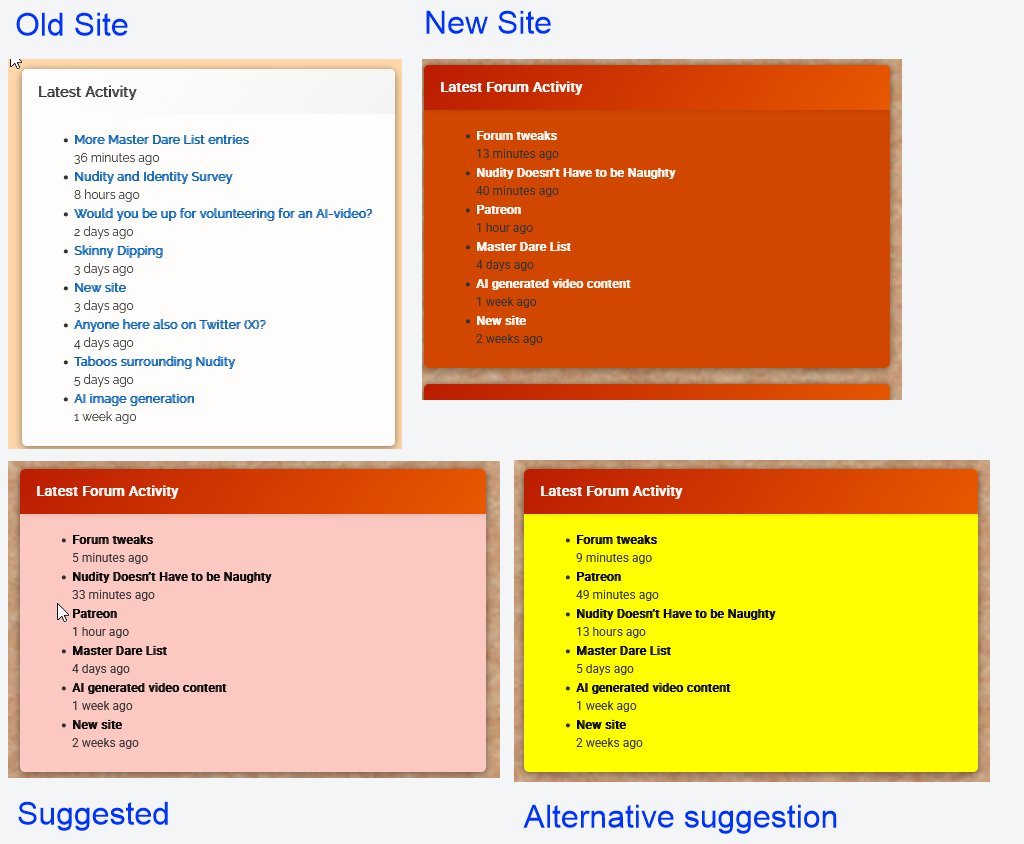
::@ed: “What do you think of the yellow then?”
I saw it a few minutes ago, and it looked OK but the post titles had mysteriously lost their bold attribute.
Now I look again and the bold is back, but the text has turned grey (rgb(85, 85, 85) instead of true black.
“That’s a level of control I don’t have. All I can pick is a colour scheme.”
If I understand https://op111.net/posts/2008/08/wordpress-child-themes/ correctly, it should only require a style.css with an @import statement and a line or two of css for any element you want to change.
But probably best to just go with the yellow (or whatever other colour is agreed) to get the new site launched, and then think about more detailed tweaks when the dust has settled.
::@ed: “Is the orange not considerably brighter than the black on your screen?”No, that’s the problem. On my windows 10 desktop, it’s not much lighter than the black.
I’ve since retried this on a new windows 11 laptop. It has given the same result, even after performing colour calibration (that confirmed it was already correctly colour calibrated).
My rule of thumb is that to be properly legible:
- black text should never appear against a tint of more than 30% of any colour other than yellow
- white text should never appear against yellow or a tint of less than 70% of any dark colour
- there is no possible background colour which provides optimum legibility for black and white text. Anything between 30% and 70% will always have limited legibility and a background cannot be less than 30% and more than 70% at the same time
- most colours other than black or white are best displayed on a white background. Yellow text is best displayed on a black backgroun.
- but whatever the background colour is, it cannot simultaneously be less than 30% and more than 70%. So trying to display black and white text together against a single colour cannot give optimum results
“I’ve set eight of the right column boxes to different bright colours to show the options.”
My impression, with the better choices in bold:
- The blue is working fine, but would not work if it had any black text in it
- The lime just about works, but would probably not work with white text
- Crimson works fine with its white text, but would not be good for black
- Pink would work better with black text if it was a lighter shade
- Teal would work better with black text if it was a much lighter shade
- Purple is great for white text, but would not work with black
- Violet is g
@ed: “Is the orange not considerably brighter than the black on your screen?”No, that’s the problem. On my windows 10 desktop, it’s not much lighter than the black.
I’ve since retried this on a new windows 11 laptop. It has given the same result, even after performing colour calibration (that confirmed it was already correctly colour calibrated).
My rule of thumb is that to be properly legible:
- black text should never appear against a tint of more than 30% of any colour other than yellow
- white text should never appear against yellow or a tint of less than 70% of any dark colour
- there is no possible background colour which provides optimum legibility for black and white text. Anything between 30% and 70% will always have limited legibility and a background cannot be less than 30% and more than 70% at the same time
- most colours other than black or white are best displayed on a white background. Yellow text is best displayed on a black backgroun.
- but whatever the background colour is, it cannot simultaneously be less than 30% and more than 70%. So trying to display black and white text together against a single colour cannot give optimum results
“I’ve set eight of the right column boxes to different bright colours to show the options.”
My impression, with the better choices in bold:
- The blue is working fine, but would not work if it had any black text in it
- The lime just about works, but would probably not work with white text
- Crimson works fine with its white text, but would not be good for black
- Pink would work better with black text if it was a lighter shade
- Teal would work better with black text if it was a much lighter shade
- Purple is great for white text, but would not work with black
- Violet is great for white text, but would not work with black
- Green is not great for black text, and would probably not be much better with white
- Purple is great for white text, but would not work with black
In the examples shown, all of the schemes seem to have forced the text to the correct colour. If that’s the case, then I’d recommend using any one of the colours shown in bold above.
“the right column looks like a rainbow mess right now”
I did guess that it was only a temporary expedient so that we could evaluate the possible options 🙂
“I haven’t used yet are: Yellow, Transparent, Red and all the dark colours (brown, charcoal etc.).”
Yellow should work, assuming it forces the text to black. See the example in https://nakedexperiment.com/forums/topic/forum-tweaks/#post-799
::@ed: “I’m considering treating the blog more like a notice board “
That makes sense to me:
- it’s the first thing a visitor sees, and therefore the best place to introduce the site to new visitors
- responding to a blog post currently has limited visibility (especially as responding to a post on page 3 of the blog does not bump the post to page 1)
- if a blog/noticeboard post invites a response (eg the existing blog “Would you get naked in front of your friends?”) , it would be better to duplicate the blog post as the opening post of a similarly named forum post. The noticeboard version should then end with a link to the forum page where users can read existing responses or answer the question.
- maybe some of the panels in the rightmost column should also become “notices”. The problem here is that in the mobile view, that column does not show up until after all the blog posts have been shown. So Latest Forum Activity in the current layout is unlikely to be seen by most mobile users that do not read to the very end of the blog. The display order in mobile view is horizontal, ignoring the activity column, then the next row, and finally the activity column. But if those panels could become blog/noticeboard posts the panels could be promoted to better positions in mobile view. For example:
- Welcome to Naked Experiment
- Quick Guide to our Community
- Latest Forum Activity
- Would you get Naked in front of your Friends
- Who’s Online
- Get Age Verified (with a description about the benefits)
- etc
-
AuthorPosts