Forum tweaks

Home Forums Community & News Forum tweaks

Viewing 18 reply threads
  • Author
    Posts
    • #773
      Ed
      Keymaster
        • 237
        @ed-71
        Like
        Up
        0
        ::

        I’ve made a few tweaks to the forum’s appearance. Does this look a little clearer and more business-like?

        If you’re familiar with the old site, you should find this one looks a little more like the old one.

      • #784
        ptHarry
        Participant
          • 55
          • Experienced Poster
          @patreon_96291032
          Like
          Up
          0
          ::

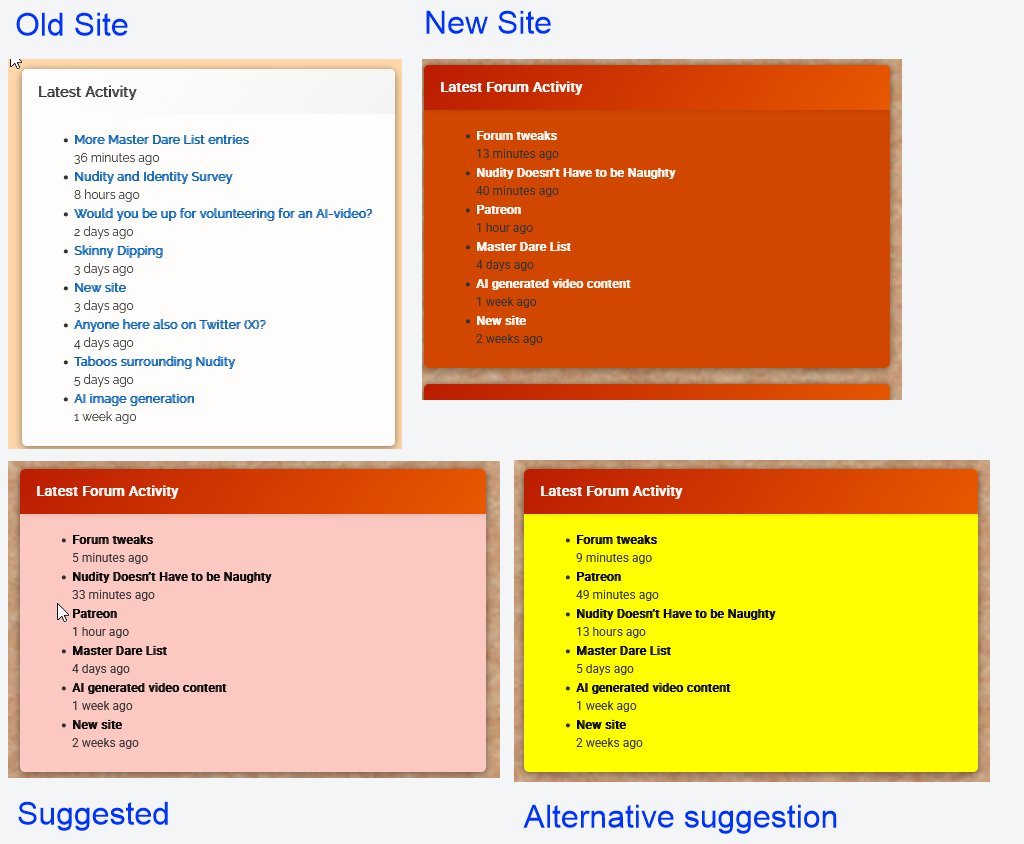
          Functionally, the layout works well.

          I’m not so sure about the colour scheme though.

          • My initial impression was that it looks a bit garish
          • In particular the dark orange background of panels like Latest Forum Activity provides poor contrast for the black text eg <span class=”pg-la-freshness”>4 days ago</span> making it very hard to read.


          • #787
            Ed
            Keymaster
              • 237
              @ed-71
              Like
              Up
              0
              ::

              I have 16 colour schemes to choose from for that panel, but it desperately needs to be something that stands out (otherwise people keep asking me to add a pane that’s already there).

              Also, I was referring the forum itself. I haven’t changed the right panel colours in a couple of weeks.

            • #788
              Ed
              Keymaster
                • 237
                @ed-71
                Like
                Up
                0
                ::

                This is tricky. One of the reasons I picked orange instead of blue, green or yellow, was that it gave better contrast with the black text. The blue and green were particularly fuzzy for me. Also it needs to be something which tones in with the other colours (orange buttons etc. – which also need to vividly stand out)

            • #789
              John
              Participant
                • 9
                • Starter
                @patreon_96273855
                Like
                Up
                0
                ::

                Can we put recent posts back to the top please? If I was last on a long thread and log in again, I have to scroll down the entire thread to find what’s been posted recently, who’s online etc

                • #792
                  Ed
                  Keymaster
                    • 237
                    @ed-71
                    Like
                    Up
                    0
                    ::

                    The top?? I’m pretty sure we’ve never done that. It was discussed at least once but I think it was widely agreed that new posts should appear at the bottom of the thread as otherwise it feels backwards or unintuitive.

                • #795
                  ptHarry
                  Participant
                    • 55
                    • Experienced Poster
                    @patreon_96291032
                    Like
                    Up
                    0
                    ::

                    @ed: “people keep asking me to add a pane that’s already there”

                    That’s probably due to them using a mobile phone, and nothing to do with the colour scheme. On desktop, those panels appear in the rightmost column, where it ought to be obvious. But on mobiles, you have to scroll right down past the last reply (which takes absolutely ages on a thread like this one) before you even get to those panels.

                    “One of the reasons I picked orange instead of blue, green or yellow, was that it gave better contrast with the black text”

                    Currently, the black text is very close to illegible against the dark orange background. Black on yellow is well known for being the most legible colour combination there is — but you can’t (or at least, shouldn’t) put white text on a yellow background.

                  • #798
                    ptHarry
                    Participant
                      • 55
                      • Experienced Poster
                      @patreon_96291032
                      Like
                      Up
                      0
                      ::

                      Interesting … I’ve just noticed the bin option is back 🙂

                    • #799
                      ptHarry
                      Participant
                        • 55
                        • Experienced Poster
                        @patreon_96291032
                        Like
                        Up
                        0
                        ::

                        Activity Comparison

                        activityComparison

                        • #803
                          Ed
                          Keymaster
                            • 237
                            @ed-71
                            Like
                            Up
                            0
                            ::

                            Is the orange not considerably brighter than the black on your screen?

                            If it’s a problem, I’ll need to work out how to recolour all the buttons as they are matched to the orange boxes. I thought it was a nice, clear highlight colour to make certain things easy to see.

                        • #801
                          Ed
                          Keymaster
                            • 237
                            @ed-71
                            Like
                            Up
                            0
                            ::

                            I can’t just choose colours. I can only choose between preset colour schemes. To elaborate, I cannot change individual colours, just pick a scheme which recolours the entire box.

                            If bright orange is too dark, I have limited options as that’s middle brightness. I’ve tried blue (same brightness level but different hue). Is that better? Personally I think it clashes.


                            Actually, I’ve set eight of the right column boxes to different bright colours to show the options. From top to bottom they are Blue, Lime, Crimson, Pink, Teak, Purple, Violet, Green & Purple. Ones I haven’t used yet are: Yellow, Transparent, Red and all the dark colours (brown, charcoal etc.).

                            • #804
                              Ed
                              Keymaster
                                • 237
                                @ed-71
                                Like
                                Up
                                0
                                ::

                                I’m hoping for some comments soon as the right column looks like a rainbow mess right now.

                              • #810
                                ptHarry
                                Participant
                                  • 55
                                  • Experienced Poster
                                  @patreon_96291032
                                  Like
                                  Up
                                  0
                                  ::
                                  @ed: “Is the orange not considerably brighter than the black on your screen?”

                                  No, that’s the problem. On my windows 10 desktop, it’s not much lighter than the black.

                                  I’ve since retried this on a new windows 11 laptop. It has given the same result, even after performing colour calibration (that confirmed it was already correctly colour calibrated).

                                  My rule of thumb is that to be properly legible:

                                  • black text should never appear against a tint of more than 30% of any colour other than yellow
                                  • white text should never appear against yellow or a tint of less than 70% of any dark colour
                                  • there is no possible background colour which provides optimum legibility for black and white text. Anything between 30% and 70% will always have limited legibility and a background cannot be less than 30% and more than 70% at the same time
                                  • most colours other than black or white are best displayed on a white background. Yellow text is best displayed on a black backgroun.
                                  • but whatever the background colour is, it cannot simultaneously be less than 30% and more than 70%. So trying to display black and white text together against a single colour cannot give optimum results

                                  “I’ve set eight of the right column boxes to different bright colours to show the options.”

                                  My impression, with the better choices in bold:

                                  • The blue is working fine, but would not work if it had any black text in it
                                  • The lime just about works, but would probably not work with white text
                                  • Crimson works fine with its white text, but would not be good for black
                                  • Pink would work better with black text if it was a lighter shade
                                  • Teal would work better with black text if it was a much lighter shade
                                  • Purple is great for white text, but would not work with black
                                  • Violet is g
                                • #811
                                  Ed
                                  Keymaster
                                    • 237
                                    @ed-71
                                    Like
                                    Up
                                    0
                                    ::

                                    That’s a level of control I don’t have. All I can pick is a colour scheme. I cannot choose individual colours (eg change the text on its own).

                                  • #812
                                    Ed
                                    Keymaster
                                      • 237
                                      @ed-71
                                      Like
                                      Up
                                      0
                                      ::

                                      What do you think of the yellow then?

                                      Also, does anyone else have opinions on this? I feel there should be a few more opinions on this…

                                    • #817
                                      ptHarry
                                      Participant
                                        • 55
                                        • Experienced Poster
                                        @patreon_96291032
                                        Like
                                        Up
                                        0
                                        ::

                                        @ed: “What do you think of the yellow then?”

                                        I saw it a few minutes ago, and it looked OK but the post titles had mysteriously lost their bold attribute.

                                        Now I look again and the bold is back, but the text has turned grey (rgb(85, 85, 85) instead of true black.

                                        “That’s a level of control I don’t have. All I can pick is a colour scheme.”

                                        If I understand https://op111.net/posts/2008/08/wordpress-child-themes/ correctly, it should only require a style.css with an @import statement and a line or two of css for any element you want to change.

                                        But probably best to just go with the yellow (or whatever other colour is agreed) to get the new site launched, and then think about more detailed tweaks when the dust has settled.


                                      • #818
                                        Ed
                                        Keymaster
                                          • 237
                                          @ed-71
                                          Like
                                          Up
                                          0
                                          ::

                                          I’ve had very bad experiences with child themes and CSS is near impossible to set up if you didn’t create the original theme. I find components are never named properly so you can’t separate out what you need.

                                          I’m not getting involved in that. It’s complicated enough as it is without the hair-tearing experience of messing with CSS.

                                      • #807
                                        Rob
                                        Participant
                                          • 13
                                          • Starter
                                          @patreon_170350251
                                          Like
                                          Up
                                          0
                                          ::

                                          The orange was nice the rainbow is not good

                                          • #808
                                            Ed
                                            Keymaster
                                              • 237
                                              @ed-71
                                              Like
                                              Up
                                              0
                                              ::

                                              The rainbow isn’t good, but I’m waiting for opinions on each of the possible colour options for the highlighted boxes in the right column.

                                          • #819
                                            Ed
                                            Keymaster
                                              • 237
                                              @ed-71
                                              Like
                                              Up
                                              0
                                              ::

                                              I shouldn’t really be talking about the colour scheme of the right column boxes here as this thread is about the forum, but it would be good to get more feedback about the yellow colour. Does it work? Can you read it? Does it stand out (ie catch your attention)?

                                              • #822
                                                Anonymous
                                                  • 49
                                                  • Experienced Poster
                                                  Like
                                                  Up
                                                  0
                                                  ::

                                                  Black on yellow might be a bit in-yer-face. It seems to say “stop what you’re doing and look at me” which isn’t very friendly!!

                                                • #827
                                                  Ed
                                                  Keymaster
                                                    • 237
                                                    @ed-71
                                                    Like
                                                    Up
                                                    0
                                                    ::

                                                    Those boxes are supposed to be attention-grabbing. They should really stand out. That’s why I picked the bright orange colour before. I didn’t expect any problems seeing the text. My laptop has an excellent screen but my external monitor is Pantone certified. The black text on bright orange was perfectly clear on both screens. It was even clearer on my phone but that’s because the pixels are smaller on my phone and the buttons are shown oversized.

                                                  • #828
                                                    Ed
                                                    Keymaster
                                                      • 237
                                                      @ed-71
                                                      Like
                                                      Up
                                                      0
                                                      ::

                                                      It’s hard to meet the attention-grabbing requirement and be friendly too. Aren’t those things mutually exclusive?

                                                    • #840
                                                      Anonymous
                                                        • 49
                                                        • Experienced Poster
                                                        Like
                                                        Up
                                                        0
                                                        ::

                                                        Agreed

                                                    • #820
                                                      Anonymous
                                                        • 49
                                                        • Experienced Poster
                                                        Like
                                                        Up
                                                        0
                                                        ::

                                                        For me, the clearest one to read is probably the one for “recent posts” (white text on purple(?) background). The original black-on-fake-tan scheme was also readable on my screen, but I do have it turned up quite bright. If you’re looking for a colour scheme for the site, where do most people get naked? I haven’t been counting but I imagine it’s out in the garden or woods, so something rural could work. Otherwise the colours in “undressing Gaby” could work well (and poor Gaby would have another claim to fame 😁)

                                                        Undressing gaby

                                                      • #821
                                                        Rob
                                                        Participant
                                                          • 13
                                                          • Starter
                                                          @patreon_170350251
                                                          Like
                                                          Up
                                                          0
                                                          ::

                                                          Css is fun when playing with your own stuff.

                                                          Most CSS files get all the spaces, eol chars and formatting removed making it very hard to read. Also amending anything in case can have serious performance issues.


                                                          If it ain’t needed don’t add it is the basic rule with css.

                                                        • #823
                                                          Rob
                                                          Participant
                                                            • 13
                                                            • Starter
                                                            @patreon_170350251
                                                            Like
                                                            Up
                                                            0
                                                            ::

                                                            <p style=”text-align: left;”>To be honest to miss the orange. All the boxes are easy enough to read with all the colours in the background but the Orange feels like it keeps a link to history from before. The other boxes stand out bit the feel forced and not natural part of the site.</p>

                                                            • #825
                                                              Anonymous
                                                                • 49
                                                                • Experienced Poster
                                                                Like
                                                                Up
                                                                0
                                                                ::

                                                                Well, if the overall background represents sand, and the orange colour is obviously fake tan, then yellow must be the sun, which is always nice to have. 🌞🪣🍦⛱️

                                                              • #829
                                                                Ed
                                                                Keymaster
                                                                  • 237
                                                                  @ed-71
                                                                  Like
                                                                  Up
                                                                  0
                                                                  ::

                                                                  I miss the orange too, but if some people can’t read it, it’s not good enough. I can’t have that.

                                                              • #846
                                                                Ed
                                                                Keymaster
                                                                  • 237
                                                                  @ed-71
                                                                  Like
                                                                  Up
                                                                  0
                                                                  ::

                                                                  Are we going with the yellow? If so, I put the lower boxes back to their normal colours.

                                                                • #847
                                                                  ptHarry
                                                                  Participant
                                                                    • 55
                                                                    • Experienced Poster
                                                                    @patreon_96291032
                                                                    Like
                                                                    Up
                                                                    1
                                                                    ::

                                                                    @ed: I’m happier with the yellow than any of the other current choices.

                                                                    • #849
                                                                      Ed
                                                                      Keymaster
                                                                        • 237
                                                                        @ed-71
                                                                        Like
                                                                        Up
                                                                        0
                                                                        ::

                                                                        Obviously, not my first choice but the yellow is acceptable to me.

                                                                    • #856
                                                                      Ed
                                                                      Keymaster
                                                                        • 237
                                                                        @ed-71
                                                                        Like
                                                                        Up
                                                                        1
                                                                        ::

                                                                        So, is everyone mostly happy now? I kept the highlighted boxes yellow in colour, and all the others have returned to their usual white text on a black box.

                                                                        • #884
                                                                          Anonymous
                                                                            • 49
                                                                            • Experienced Poster
                                                                            Like
                                                                            Up
                                                                            2
                                                                            ::

                                                                            thumbs up

                                                                        • #902
                                                                          ptHarry
                                                                          Participant
                                                                            • 55
                                                                            • Experienced Poster
                                                                            @patreon_96291032
                                                                            Like
                                                                            Up
                                                                            3
                                                                            ::

                                                                            Copying TheG’s useful image … thumbs up  too 🙂


                                                                          • #913
                                                                            Jesss
                                                                            Participant
                                                                              • 52
                                                                              • Experienced Poster
                                                                              @patreon_163722564
                                                                              Like
                                                                              Up
                                                                              0
                                                                              ::

                                                                              How do you feel about people adding tiny images like the thumbs up Ed?

                                                                              • #917
                                                                                Anonymous
                                                                                  • 49
                                                                                  • Experienced Poster
                                                                                  Like
                                                                                  Up
                                                                                  2
                                                                                  ::

                                                                                  Apologies for my sense of humour. (I often have to say that!!) I confess that I took the 1K size limit as a challenge, and subverted the lack of a “like” button as a bit of mischief.

                                                                                • #922
                                                                                  Ed
                                                                                  Keymaster
                                                                                    • 237
                                                                                    @ed-71
                                                                                    Like
                                                                                    Up
                                                                                    0
                                                                                    ::

                                                                                    I’d prefer it if they didn’t. Especially outside the age-verified forums as it puts the site in breach of the law. I really don’t want a massive fine.

                                                                                • #928
                                                                                  Ed
                                                                                  Keymaster
                                                                                    • 237
                                                                                    @ed-71
                                                                                    Like
                                                                                    Up
                                                                                    0
                                                                                    ::

                                                                                    As the forum appears to be set up properly now, I’m shifting my attention to moving all the nudity-featuring blog posts into the appropriate forums.

                                                                                  • #936
                                                                                    ptHarry
                                                                                    Participant
                                                                                      • 55
                                                                                      • Experienced Poster
                                                                                      @patreon_96291032
                                                                                      Like
                                                                                      Up
                                                                                      1
                                                                                      ::

                                                                                      @TheG: “I confess that I took the 1K size limit as a challenge”

                                                                                      Maybe it needs to be reduced to 1 byte 🙂

                                                                                      • #938
                                                                                        Ed
                                                                                        Keymaster
                                                                                          • 237
                                                                                          @ed-71
                                                                                          Like
                                                                                          Up
                                                                                          0
                                                                                          ::

                                                                                          It’s measured in KB. Less than 1 is not allowed.

                                                                                    Viewing 18 reply threads
                                                                                    • You must be logged in to reply to this topic.